Challenge
The Android app fell behind the iOS experience with inconsistent UI and missing features, leading to a fragmented experience for members. How might we translate the iOS experience into a native, cohesive Android app that feels consistent with the brand?
Impact
01
Delivered a fully native Android design system, aligning iOS and Android experiences to ensure brand consistency across platforms.
02
Unlocked all core features for Android users that were previously exclusive to iOS - improving parity across the member experience.
03
Established a scalable UI framework that enables Soho House to maintain, evolve and expand its digital presence beyond iOS.


Approach
01 - Audit & gaps
I reviewed the full iOS experience to pinpoint what Android was missing - features, interactions and components needing adaptation.
02 - Systematised foundation
I defined clear component behaviours, hierarchy, spacing, elevation and navigation to create a cohesive Android structure.
03 - Native translation
Rather than copy iOS, I rebuilt the UI using Material Design patterns, keeping the brand while making the app feel truly Android.
04 - Platform alignment
This groundwork enabled future features to be designed and built in parallel across iOS and Android, ensuring consistency and scalability.
Building a cohesive Android toolkit
To support a scalable rollout, I created a dedicated Android UI toolkit that translated the Soho House experience into clear, reusable components and patterns. This enabled designers and engineers - both internal teams and partners - to build new screens consistently, speed up delivery, and maintain parity with iOS without reinventing the basics each time.

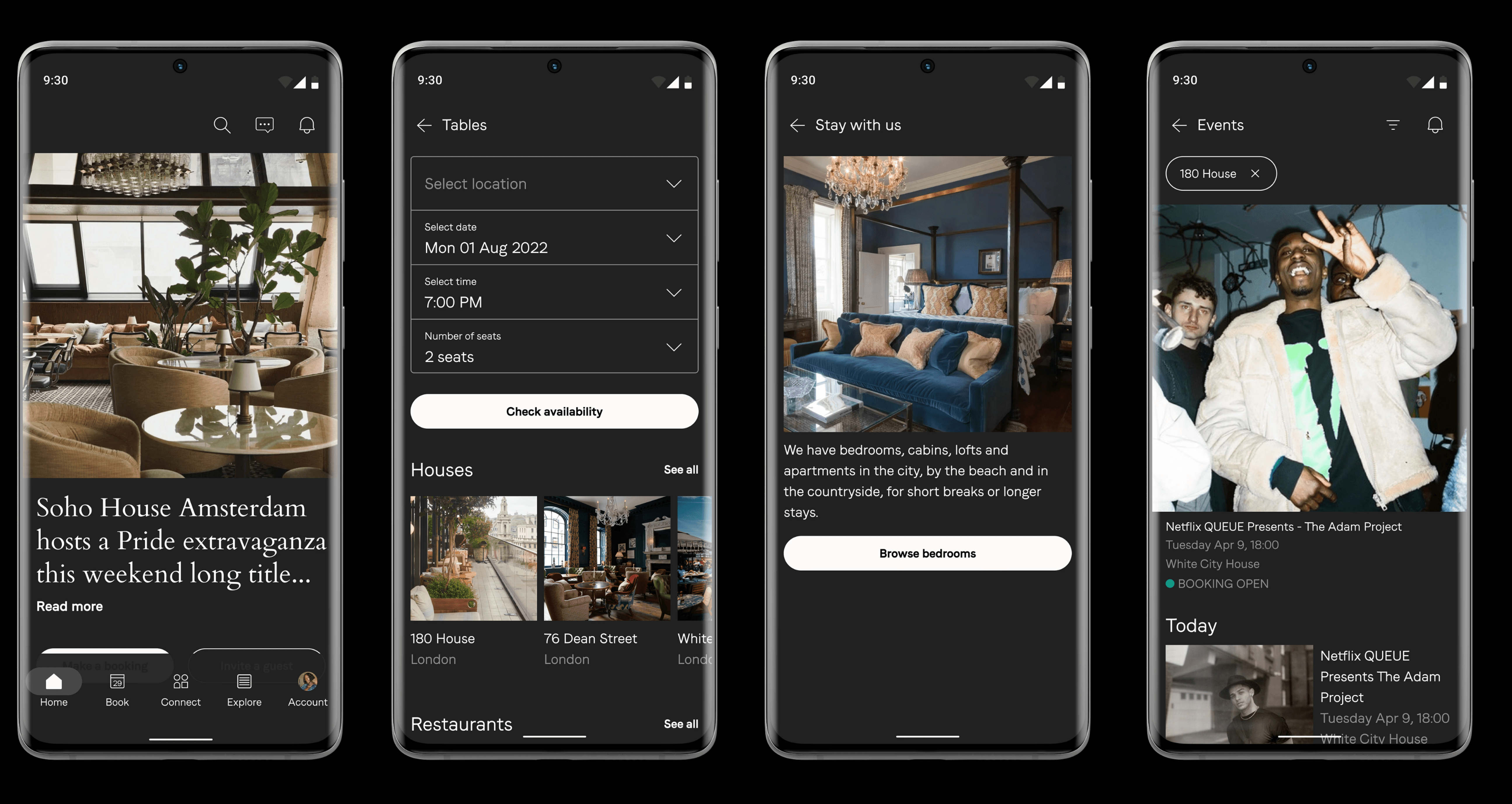
Native Android successfully applied




Outcome
The new approach helped align the product and engineering teams, brought the Android experience closer to iOS, and made the overall product more consistent across platforms.
01
Brought feature parity to Android, making previously iOS-exclusive experiences available to all members and contributing to a 35% increase in positive Google Play app reviews.
02
Expansion of the Soho House brand experience, conquering new digital platforms.
03
The redesigned app also introduced a small Android design system, which made handoff easier, improved collaboration, and helped the team move faster when building new features.
Learnings
01
Design systems are a living product
02
Good collaboration makes better products
03
Small improvements have a big impact
This project made me appreciate the work that happens behind the scenes. Users rarely notice a better design system, but they do notice when a product feels consistent and easy to use. It taught me to think beyond individual screens and focus on building foundations that help both users and the team every day.
Most of all, this project showed me that small improvements can have a huge impact. A clearer component, a better pattern or stronger documentation might seem like a small change, but when it's used across the whole product, it helps everyone work faster and creates a more consistent experience.